Thursday, 28 March 2013

This weeks inspiration


I like the bright colours used on this piece of art. This is done by Alex Trochutt. I also like the melting effect of the letters, but how you can still understand it.


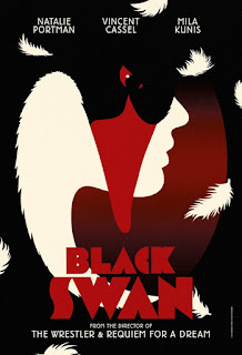
I like this because of the brightly coloured vectors. I find it very eye catching and appealing to look at for all ages. 


Reflection Of Last Week

Last thursday I continued developing my poster, until I got it to where I liked it. I developed the design/ layout of the poster, layout of the text that had to go on the poster and where the tyneside cinema logo was going to go on it. 

On friday we had a presentation off Tyneside Cinema. The woman went through their design process so that we know how they work with their designer. It takes quite a few cycles until they get their posters etc complete as alot of people have input with ideas.

Friday, 15 March 2013

Photoshoot

Today we had our photoshoots. This was the first time I've collaborated with a photographer for a project. I also art directed the shots that I wanted, from this I have learnt that I need to speak up a bit more as the photographer and the model couldn't really here me. I think the fact that we both wanted the same kind of shot helped us get on better and make it a great first experience for me.

Tuesday, 12 March 2013

Inspiration

Here are some film posters I've been looking at this week which I find inspirational for my work.


The vectors in this poster are similar to that of Hitchcocks posters by Saul Bass. And the use of  3 colours also.

This is a poster by Saul Bass for Hitchcock, he's used 3 colours and kept it simple. 

Monday, 11 March 2013

Upcoming This Week

This week on thursday I will be refining my ideas for the poster, and on friday I will be meeting the photographers in the afternoon and shooting the images for my poster.

Reflection Of Last Week

Meeting with the photographer on friday was helpful, and we both had the same kind of idea, so we didn't have to work much out. I think my Hitchcock poster should be as I want it.

Friday, 8 March 2013

Inspiration

Here are some of things I have pinned on interest as my inspiration for the week. 

I like this Saul Bass poster because of the jaggered effect and minimalistic colours used.


I like The Shining poster by Saul Bass because it only has 2 colours on it and the face from the film is created from pixels.


I like this typography by David Carson because of the scratchy effect. It could create a scared mood.


Upcoming

This week I will be presenting my research and style boards for the Hitchcock module on thursday and on friday I will be meeting with the photographers who will be shooting the photos that I will use on my final poster. 

Reflection of Module

Reflection of Typographic & Editorial Design Module

This module ran from the 10th January 2013 until the 22nd February 2013. It was quite a long going module but it was worth it in the end. From this module I learned that on magazines white or clear space can be good, and that magazines don't have to be packed with information to be appealing. Eventhough the double page spreads that I created had alot on them, you can still use a minimal approach and just have a few bits of writing etc in different shapes.